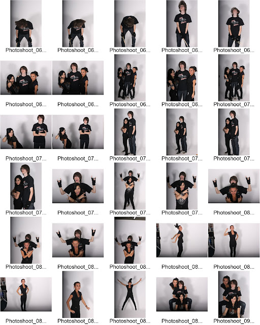
Monday 19 December 2011

Article Draft

Anyone who hasn’t had the privilege of having listened to this next band’s talents, are really missing out! After the impact they’ve had on the UK perhaps they’ll be crossing the seven seas to treat the rest of the world with their legacy. Never backing down, they’ve had two hit singles this year alone and have now scored a deal with a major production label for three additional Albums. We caught up with Dan from the tight-knit band “Unending Massacre” consisting of; talented Drummer come Guitarist Dan, backed up by lead singer and rhythm guitarist Tasha and bassist Grace, and their current affairs before their UK tour in a few weeks time. Here to talk to us today, we have “Unending Massacre!

First of all; thanks for coming in to talk to us guys.
Really, the pleasures all mine; it’s an honour to be representing my band for ‘RAW!’So, let’s get straight into it, what made you so interested in metal music?
As a small child my parents pushed me towards their era’s music; Metallica, Lynrd Skynrd and Meatloaf, this greatly influenced me as I grew up exploring the similar genre of music, listening to the likes of Bullet for My Valentine, Slipknot and Bring Me The Horizon. I developed a passion for the music and idolized the artists-
-And that’s why you learned to play Drums AND Guitar?
Exactly! I love being able to play my instruments, it gives me the freedom to explore every musical thought that pops into my head and occasionally that develops into a full blown album track!
Wow! I truly envy you; I would love to be able to just mess around and play something off the top of my head. Improvising!
Haha! It is very helpful at times but most of all it just keeps me sane after a bad day!
So you write all your songs yourself I believe?
Yes, I do, with the help of my band obviously; together we just seem to click and come up with what we believe is at least half decent music.Well I assume with the support of most of the country I can safely say that you do indeed create some fantastic music; truly inspirational! How does it feel to know you’ve touched so many people with your music?
It’s truly an astonishing thing to consider that so many people like listening to what we’ve written down… It’s hard to get to terms with how far we’ve come as a band.
So, as founder of the band, how did you find your fellow band members; Grace and Tasha?
Well Tasha and I met under very odd circumstances…Oh! What circumstances were they then?
Okay. We were at a party, and had never met each other before, but she came up to me, very confident, and introduced herself asking me “Are you Dan Slater? The drummer?” and we got to talking about music. We spoke for hours about what influenced us and what made us so passionate about music.
How was that an “odd” circumstance?
Well… the problem was I was hammered at the time and this story is only what Tasha has told me had happened that night! She wrote her number in my phone and I was curious who she was the next day… So after my hangover had subsided I called the number and after a brief catch up about the previous night we organized to go for a jamming session and the rest is history.
Sounds beautiful! What about the story of you and Grace then?
Not quite as embarrassing but basically-
No-no-no, we want the full story here Dan.
Haha! Okay. While messing around in a rehearsal room playing different riffs and beats I heard a catchy bass riff from the next room, I stopped to listen for a bit and then couldn’t help myself from going in and seeing who this incredible musician was; I opened the door to the next room and low and behold Grace in all her ‘heavy-metal’ glory and as she turned around the thought of creating a three piece band just sort of hit me.
Wow! That’s a truly moving story. Let’s focus more on you for a moment. Are there any women in your life at the moment?
Oh dear, I was afraid you might ask that. Well, there’s one girl I might and things are going pretty well but it’s pretty secret at the moment so I won’t reveal WHO she is… All I can tell you is that she is in another band at the moment and our paths cross quite often on tour so we do get to see each other pretty often.
Ooh La La Dan! Love is in the air I see! I was wondering; are there any artists you would like to make some songs with?
Oh wow. I’ll have to think about this!
Please. Take your time!
Hmmm… Okay, I would die to make a song with Bullet For My Valentine, purely because they’re British and I LOVE their music.
I can see that working out! That would be a chart topping single right there!
Oh I don’t know about that-
It would be! We should set this up!
Hahaha! Okay I’ll let the band know to start practising!
Hehe. Tell me about your upcoming US tour then.
Well, we’re off in a couple of weeks’ time! It’s really exciting but so daunting at the same time. We’re starting off in California and working our way east across the States, all the way to New York City!
Wow that sounds amazing! How many shows are you playing and is there any venue you’re looking forward to playing above the others?
We’re playing 33 shows across 26 states. Or is it 26 shows a across 33 states? No it’s definitely the first one. But I think the best venue will be the first one; The LBC!
So many of the true heavy metal greats have played on that stage.
I know! It’s so gratifying to be accepted by the venue that’s hosted the likes of Avenged Sevenfold. I think after we play there I might die from happiness.
I truly hope not! I don’t think we’ve heard enough of you lot yet! Unending madness definitely has more in store in my opinion.
I hope you’re right! We will certainly try our absolute hardest to deliver our best every time. It’s all for the fans!
Thanks for coming in to talk to us here at ‘RAW!’ and good luck with the tour!
Haha, thank you! Thanks for the opportunity to talk to you!

Magazine Draft Drafts


Double Page Spread Draft


Tuesday 13 December 2011

Diary Entry Week 11


This week I completed my Masthead design.
I used my chosen name idea, "RAW", and created effects to it on Photoshop. I used musical ideas to connect the masthead with the music magazine. I chose a gradient of red for my masthead, as it relates to the colour scheme of my magazine. I filmed the process on Camstudio, and imported the video into Premiere. I increased the velocity to produce a timelapse. I then rendered this and posted it on my blog.
I also began researching contents ideas, to help me produce a contents page for my own magazine. I will post my research as well as my own ideas on the blog when it is completed.

Saturday 10 December 2011

Magazine Proposal - Video

This is a quick video I made in order to propose the idea of my Magazine and show that I have thought out all the necessary areas and planned what I am going to do and how much I will charge for it etc.

Tuesday 6 December 2011

Diary Entry Week 10


After completing my Music Magazine proposal and mood-board, I then started working on my name ideas, colour scheme and colour connotations, and audience profile.

I created a list of potential names for my magazine. These names were words related to music in general. From my list of 29 possible magazine names, I cut it down to 5; 'Beat', 'Treble', 'Rhythm', 'RAW' and 'Forte'. Eventually, I decided on 'RAW'. The reason behind this was because of the several meanings behind the name. It expresses possibly the most important aspect of a successful band/artist and one of the most important elements of music. As the majority of my magazine is dedicated to unsigned talent, it also subconsciously mean that the magazine provides ‘RAW’ metal music.

For my colour scheme, I decided on Black, White and Red. Although they are contrasting colours, they also complement each other nicely, as they stand out when together, which is important in a successful magazine.

Thursday 1 December 2011

Double Page Spread Analysis

Mise-En-Scene Evaluation

Mise en Scene

Tuesday 29 November 2011

Magazine Analysis

Possible Location Shooting 4

This is the last of the locations i shot around school today and i like it because its a wide open area of concrete. Should I set up a backdrop it could be the main location for the majority of my location shoot.


Diary Entry Week 9


This week I began the planning stage of my Music Magazine. I started by completing a proposal - which outlines several important aspects and elements of my magazine that I must take into consideration, such as the target audience, the style of the magazine, and the financial elements (price, subscriptions, etc.).

I also created a mood-board, which will help me generate ideas for my own magazine. The mood-board includes pictures of different aspects of music magazines as well as music itself. The mood-board contains images of famous bands and solo artists specifically for the genres my magazine will be covering, popular gigs and festivals as well as possible equipment and props sometimes used in a photo-shoots to help me plan my own.

Wednesday 23 November 2011

Possible Location Shooting 3

I considered using dark alleyways in my photo shoot and this one; just outside my school, is one of the contenders.


Tuesday 22 November 2011

Diary Entry Week 8


I continued to work on and completed my Key Concepts and Magazines research. The presentation contains the concepts of a music magazine. I also created a number of questions that would help me find out more about the target audience of my magazine, which would help improve my knowledge of what the audience would like to see and read in a magazine. These polls were then placed on my blog, for users to vote on which answers fit their preferences.

To help plan my magazine, I created a proposal, stating the different features that will be used or changed in my magazine, such as the price, style and content.

Saturday 19 November 2011

Tuesday 15 November 2011

Diary Entry Week 7


This week I began planning my photoshoot. I created a plan on a Word document, and brainstormed ideas - these included elements such as different camera shots, props, lighting, etc. In order to carry out my plan I carried out research on several mainstream magazines with photoshoots and listed points that made it a good photoshoot.

Audience Profile

My key demographic would be a young generation who perhaps go to university although there may be many people who were interested in the magazine despite the target audience being specific to 20 year olds.
They would generally be ‘metal-heads’ who constantly listen to music while travelling to work or gigs on public transport or in their cheap cars which serve no purpose other than transport.
The target audience will particularly enjoy Heavy Metal that is not over the top with screaming but with good quality Metal and singing as well as impressive guitar and drum solos.
They would have a part time job but all their money would be spent on going to see their favourite bands live and would be the kind of ‘die hard’ fans who push their way to the front to be closer to their idols and the action.
They would already be subscribed to various other music magazines as any free time they have, if there’s no gig on, would be spent either reading the magazines or relaxing at home or at a mates with Metal playing in the background.
Their perfect night out would be meeting up with their mates, having a few drinks, heading to a Bullet For My Valentine gig, getting right to the front and singing along with the songs, word for word. They would also be willing to spend some extra cash to get backstage if they could to meet the band afterwards and generally, have a good time.
Thanks to the results of my poll (posted on my blog) I have found that my target audience would prefer a simplistic and appealing layout, suggesting that they themselves would be simplistic people who aren’t fussy. This is further supported by the next question where the majority answered saying they’d rather have a minimalist and simple front cover.
They would prefer Interviews and General Music News, accompanied by many pictures to keep the magazine interesting and aesthetically pleasing.
More people have said that they would prefer a monthly magazine and that they would prefer that on paper form.
Of the 17 people that answered whether they were subscribed to a music magazine, 5 said yes and 12 said no but only 1 out of those 12 said they wouldn’t subscribe to one in the future, therefore I will be aiming to sell my magazine in a shop as generally people don’t subscribe but buy on impulse, again displaying the type of personality my readers have.
They also said that Black and Red are the most relatable colours to the heavy metal culture and that the body positioning and/or poses that the Band members make are the most important when taking photos whereas the second most important is their appearance, mostly clothing.

Name Creation Slideshow

Wednesday 9 November 2011

Magazine Poll Results

I evaluated the results from my poll (published on my blog) and I turned the results into tables to better express how the various people responded to the questions and to make it more clear why I made certain decisions for my magazine.

Tuesday 8 November 2011

Audience Research

1.       My key demographic would be a young generation generally in the C2DE group of the NRS social grade. They would generally be ‘metal-heads’ who constantly listen to music while travelling to work or gigs on public transport or in their cheap cars which serve no purpose other than transport. The target audience will particularly enjoy Heavy Metal that is not over the top with screaming but with good quality Metal and singing as well as impressive guitar and drum solos.
2.       Metal heads are usually spotted by their looks. Usually denim jeans (Blue or black), band shirts, long hair/shaved hair, etc. The metal heads truly are the stupidest group of people to pick a fight with, we may be the quiet type, but metal heads could easily wipe out multiple kids, and have a short temper that goes along with that. The metal culture however has dropped quite a bit, seeing as how the "hip" thing is to listen to rap or other modern catchy songs.
3.       I questioned some people from the general public and also some people from outside a ‘Bullet For My Valentine’ concert. I found many interesting things including the fact that Black and Red are the most relatable colours to the heavy metal culture and that the body positioning and/or poses that the Band members make are the most important feature. The second most important was found to be their appearance, mostly clothing.

Possible Location Shooting 1


I wanted to try and see if there were any possible locations around school that were feesable to use in my music video. I am happy with a few of them as they convey the necessary 'dark, dank and creepy' feel in the shot.


Diary Entry Week 6

I have completed my preliminary task - which consisted of designing a magazine front cover and contents page. We were to begin by planning the front cover and contents by sketching it on pieces of A4 paper. Once this was completed we then went out to take photos for our covers. We then uploaded them onto the computer and imported them into Photoshop. I originally had problems, because I had never used Photoshop before and was getting used to the tools. But based on my skills with other graphics editors, I eventually got used to the program and began inputting my draft onto the computer.
I also completed an analysis of three front covers, three contents pages and two double page spreads. I analysed the individual features that make up these parts of a magazine.

Colour Connotations Presentation

Wednesday 2 November 2011

Tuesday 1 November 2011

Market research 2

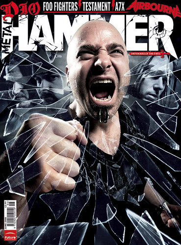
I found some more images from an extremely popular Heavy Metal magazine; "Metal Hammer" which again show the colour scheme I want to use, the grey/blue tint in the glass (right) is really effective as the other members of the band are shown but only when you focus; this makes a very intriguing and exciting front cover.

Market Research 1

I did some research for similar 'Metal' magazines that use my colour scheme and I found a magazine cover that stands out exactly how I would like mine to.

It uses vast quanitities of Black and White and the Black/Red contrast grabs my attention and draws my eyes to this magazine cover.

Magazine Proposal Recording

Colour Connotations


I have taken the colours people voted most relevant and appropriate for a 'Heavy Metal' magazine and I have written down things that the colours could connote.
I have decided that Black, Red, White with the occasional hint of Blue would be the best colours to use as they are all very striking and powerful and connote things that are very 'in tune' with the Metal culture. They all stand out very well and there wont be any odd coloured text.

Monday 31 October 2011

Mood Board


Magazine Names

Diary Entry Week 5

This week I made a power-point containing Names for my magazine that I thought up over the course of a week. I uploaded it to SlideShare to show my ability to used varied software on my blog. Also this week I have created a mood board presentation on Prezi to show what comes to my mind when I think of Metal (the Genre of my magazine) it contains pictures from gigs, various images and signs that correspond to the metal industry.

Diary Entry Week 4

This week I wrote my music magazine proposal in Microsoft Word, however I wanted to use a different form of presentation and show the skills I have developed so I also video recorded myself putting forward my proposal. On Blogger I also uploaded my transcript to show the development process I have gone through. I am still waiting to organise a final date for my photo-shoot so I can start demonstrating with effects on the pictures. 

Audience Poll Results


I evaluated the results from my poll (published on my blog) and I turned the results into tables to better express how the various people responded to the questions and to make it more clear why I made certain decisions for my magazine.

Thursday 20 October 2011

Diary Entry Week 3

This week we were tasked with asking ourselves "What makes a music magazine last and appeal to its audience?" We realised we had to appeal to our demographic, therefore, using the gadget tool on Blogger, we created a poll, using questions that will help us gain knowledge on what our magazine should entail.
For example: What do you look for most in a magazine? In which format would you prefer to receive your magazine? and How often would you like the magazine to be published?
Also this week I started to plan my proposal. I would like to do this in a video format to change the variety of what I use on my blog.

Wednesday 19 October 2011

Magazine Proposal

I propose to create a heavy metal/rock magazine focusing more on the heavy metal side as it is more intriguing for me, I am loosely basing my magazine on “Kerrang!” a popular and very well known brand name magazine. It will be very eccentric and different to encompass the ideas of the “different” fans of heavy metal. My magazine will entail; music news (such as current band affairs and new bands) as well as gig reviews, upcoming gigs and interviews.

My magazine will be loosely following the style of “Kerrang!” in the sense that it will have a ‘house theme’; a recurring theme every month  that  will help create a brand identity that readers will be able to recognize over time.
My magazine competition involves people sending in their best and most excellent photos from any heavy metal/rock gig they’ve been to and if they win they will get 2 free tickets to a pre-determined gig of a famous heavy metal band, the band will change each month.
My magazine would be aimed at a young generation who perhaps go to university although there would be many people who were interested in the magazine despite the target audience being specific to 20 year olds. They would generally be ‘metal-heads’ who constantly listen to music while travelling to work or gigs on the underground. The target audience will particularly enjoy Heavy Metal that is not over the top with screaming but with good quality metal and good quality singing.

My magazine will be relatively cheap at the affordable price of £2.50, unless they subscribe. If people subscribe via credit card their magazines will be sent to them for the low price of £2.20. It will be released once a month on the last day of the month so everyone will know what has happened that month and also what’s coming up in the next month. Therefore; people who choose to subscribe will get their magazines cheaper than if they bought it from a shop every month.  People will be able to subscribe in multiple ways; online, by phone and by post. All they need to do is sign up and enter their credit card details. My magazine would preferably be published by “Bauer Consumer Media” as they publish a few different kinds of metal magazines so they would be
supportive in my endeavours to create the next big music magazine.

I feel my magazine will succeed as I am a fan and enjoy the style of music much more. As I am such a big Metal enthusiast I foresee that I will put more effort into my work to create something to a high standard.

Tuesday 11 October 2011

Diary Entry - Week 2

This week, after I first used SlideShare to upload my similar product research on various magazines, I moved onto the next task of writing about the key concepts and magazines. I want to use a different presenting form and so I will Prezi; an online presentation software, I am finding it very useful as it is simple to use and fun to interact with and watch. I am going into depth with the codes and conventions, audience, representation and institution. At the moment I am correcting and expanding points I’ve made about each sub-title and by the end of the week I will have completed the task with superior information and re-upload it onto my blog.

Key Concepts and Magazines


Friday 7 October 2011

Analysis of CD magazine adverts

I thought it would be beneficial to research CD magazine adverts in order to get an idea of how to design mine. I noticed in each one that the artists name are always big and bold, some ratings from music magazines and lists of the albums top songs.

kings of Leon album advert
This advert for the kings of Leon album only by the night is very well informed as well as containing a memorable image of the band that will stick with anyone who sees it in a publication. The information included is useful and relevant such as the news that it has been released "OUT NOW" where it can be bought "PLAY.COM" and what songs are included "SEX ON FIRE, CRAWL AND USE SOMEBODY". The four band members faces split up and reconnected as a single face mixedwith that of an eagle is a very memorable image which doubtless also tells fans something about the style as well as being very eye capturing.
Dethklok cd advert
This magazine advert was published in several black metal magazines to advertise the release of the first metalocalypse dethklok cd. The name of the band and album is clearly visible at the top and some of the songs are listed at the bottom. This advert is instantly recognisable as an advertisement for dethklok as it makes use of the bands logo and mascot facebones a giant skull with several large horns.
As magazine adverts go this one is lax in design as it contains very little information such as critics reviews or a release date or even information about where to obtain the album. This could of course be intentional as it causes the audience of the advert to think about and remember it due to both it’s simplicity and lack of detail and it’s shock value. This type of advert would need to be carefully aimed at the target audience of metal fans presumably a lot of thought was put into what magazines it went into and where it was published.

Tuesday 4 October 2011

Diary Entry - Week 1

So far in our Media Course we have had to make multiple items to show how much we know about photoshop, magazines, cameras and Media overall.
Our preliminary task required us to create a pencil design of a school magazine front cover and contents page and then create our visions in photoshop. Using the camera to take the pictures we needed, carefully choosing the image that would suitably represent our school magazines, we were able to download the images into photoshop and layer the fundamental aspects of a magazine over the top. We attempted to stick to our pencil designs as much as possible; however, as we came to certain obstacles such as clashing images or colours we found that we had to change our designs to be more suitable as a school magazine. When it came to finishing the cover page I still wanted to tweak things such as the outline on the title text to make it better, but had to move on to the contents page. Creating the contents page, I felt was harder, as I had spent less time designing that than the front cover. I decided that the colour scheme should remain constant so it would remain aesthetically pleasing rather than clashing. We scanned our pencil designs, converted the photoshop images to JPEG’s uploaded them to our blogs and evaluated the work we had done and explained all the reasoning we made about why we used different effects.
We have now started to evaluate different magazine products, explaining why they used different techniques on their; Front Covers, Contents Pages and Double Page Spreads. This will help us to understand more about the different styles or techniques used by the professionals making magazines.

Monday 3 October 2011

Creating key magazine pages

When designing my Front cover and contents page I decided to not focus on the colour aspects but to just get the design ready and have a basic concept of what I was going to create.
I envisioned a masthead that had 3 different fonts in order to show the irony of the “new news” but I also wanted the title to entail “School” so it stood out to kids in school and suggested it was a school newspaper.
The image I wanted for the front cover was of a teacher screaming in rage which I would Photoshop with flames in their eyes and smoke protruding from their ears. To really catch the readers attention, making them want to purchase the magazine.
The main sell line; “How to avoid the wrath of teachers” fits in with the picture of an ‘Insane’ teacher to make the reader more interested in what’s going on.
When it came to adding colour into my front cover I found that a gradient was the best way to emphasise the title and the sell lines but they can be different colours. I found that the gold/yellow writing stood out more on everything from white to green so I decided to use it for the title and sell lines, only changing the font and size to differentiate the 2.


I intended my contents page to be vibrant to ensure that people would read it and not just skim over it like most people might.
The masthead “Adele – coming to visit!!” is in a big, bold, impact font to attract the most attention, its also backed by a red background with an effect to make it more aesthetically pleasing to the reader; attracting yet more attention.
The sell lines are all in the same gold/yellow fonts to keep with the colour scheme and still stand out on everything. They are separated into groups; “Exclusives” and “Reviews” to make it easy for the intended reader to distinguish between the 2”
The main Image is of Adele. It’s an over the shoulder shot, heavily make upped and photo-shopped to make her look better and seem more appealing to everyone.
I attempted to keep the colour schemes the same in the contents page as the front cover but change the design of how they look to seem new and different. The blend of colours work well together to assure the main sell line sticks out more than the rest, however, they stick out as well.