Tuesday, 8 November 2011

Saturday, 5 November 2011


Wednesday, 2 November 2011


Tuesday, 1 November 2011
Market research 2
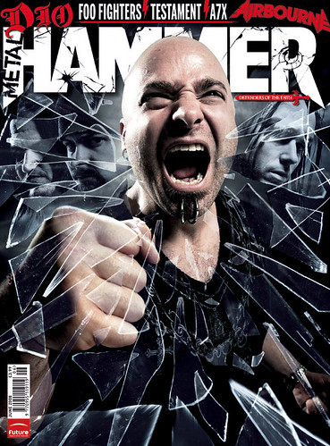
 I found some more images from an extremely popular Heavy Metal magazine; "Metal Hammer" which again show the colour scheme I want to use, the grey/blue tint in the glass (right) is really effective as the other members of the band are shown but only when you focus; this makes a very intriguing and exciting front cover.
Market Research 1
I did some research for similar 'Metal' magazines that use my colour scheme and I found a magazine cover that stands out exactly how I would like mine to.

It uses vast quanitities of Black and White and the Black/Red contrast grabs my attention and draws my eyes to this magazine cover.

It uses vast quanitities of Black and White and the Black/Red contrast grabs my attention and draws my eyes to this magazine cover.
Colour Connotations
I have taken the colours people voted most relevant and appropriate for a 'Heavy Metal' magazine and I have written down things that the colours could connote.
I have decided that Black, Red, White with the occasional hint of Blue would be the best colours to use as they are all very striking and powerful and connote things that are very 'in tune' with the Metal culture. They all stand out very well and there wont be any odd coloured text.
Subscribe to:
Posts (Atom)